Cape Marigold was a fully branded weekend experience created for a bachelorette getaway in Cape May, New Jersey. Named after the house where the group stayed, the concept was designed to feel more like a thoughtfully curated coastal retreat than a traditional bachelorette celebration.
The goal was to create something distinctive, cohesive and recognizable without relying on typical bridal party merchandise. What began as a visual identity for the weekend evolved into a complete experience, incorporating personalized apparel, accessories, house décor, printed materials and a dedicated website.
Inspired by vintage coastal aesthetics, the branding featured warm marigold tones, floral graphics and a mix of playful script and clean typography, creating an identity that felt personal, understated and memorable.
The Cape Marigold identity was built around a custom floral graphic, a warm, nostalgic color palette and typography inspired by vintage destination merchandise. The design was intentionally versatile, allowing the same visual elements to carry across apparel, accessories, décor and digital communications.
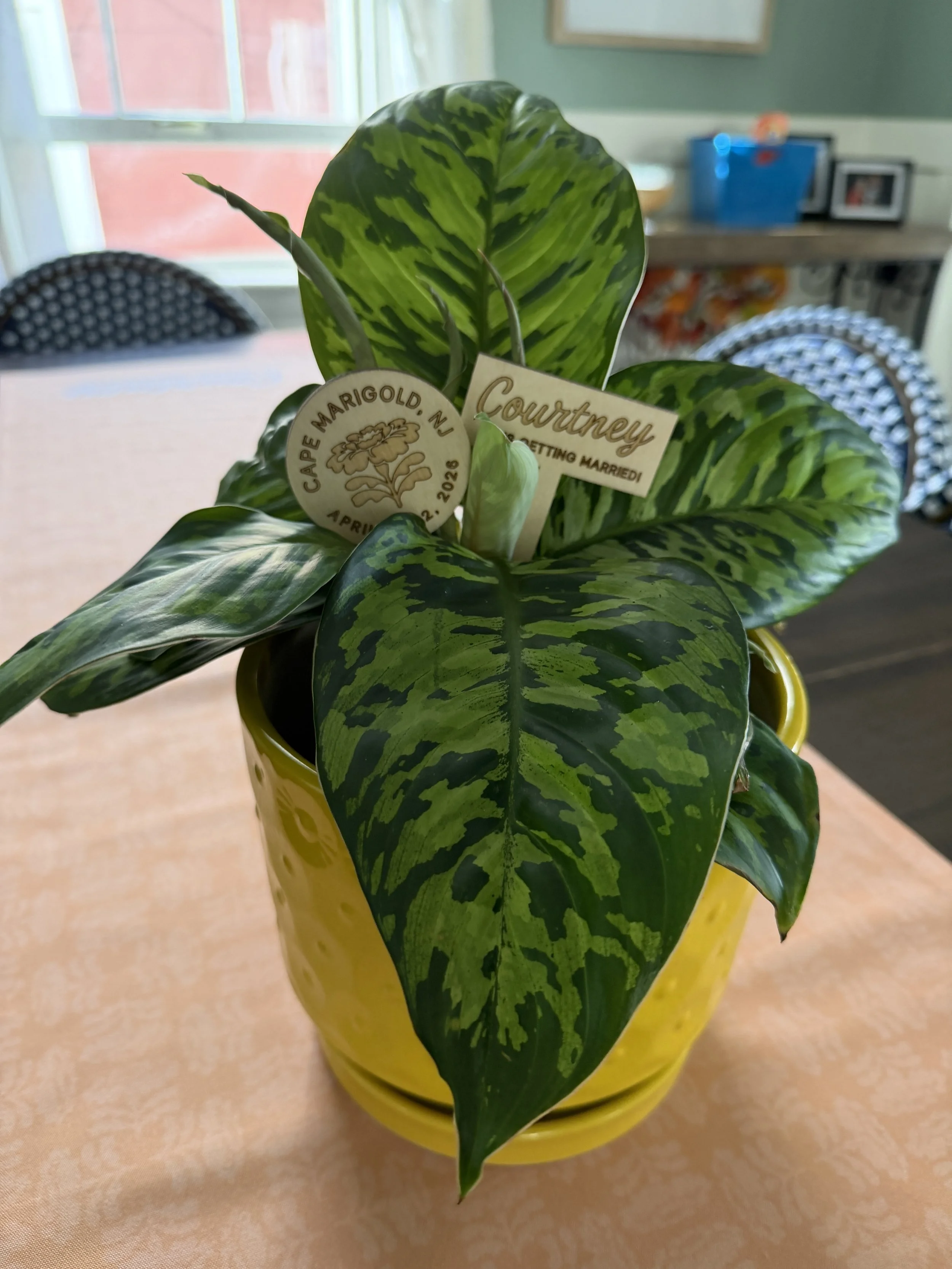
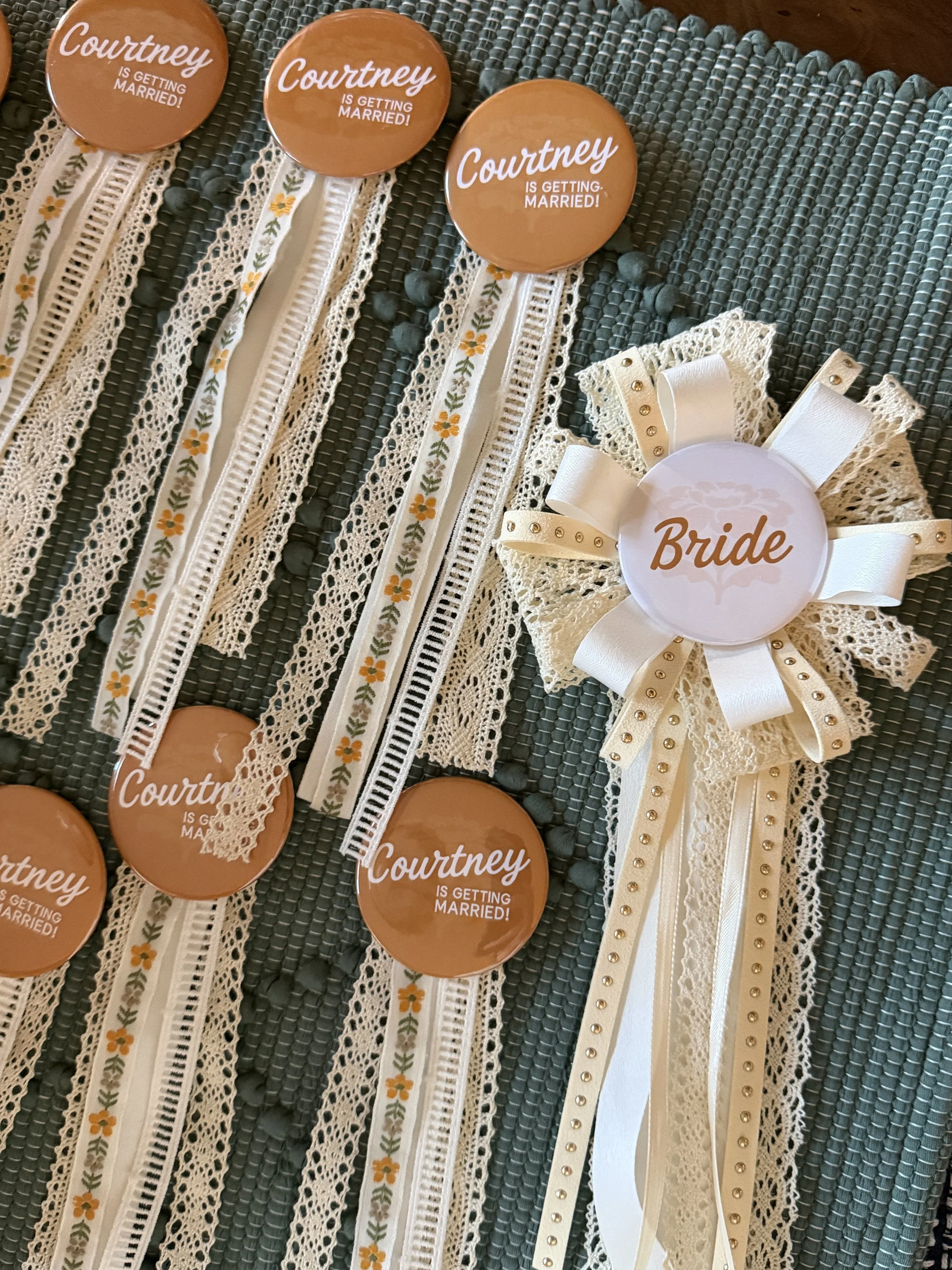
A secondary variation, "Courtney Is Getting Married," incorporated the same graphic layout and typography for select celebratory pieces. This approach allowed the weekend to maintain its own recognizable identity while subtly acknowledging the occasion without making traditional bachelorette messaging the focus.
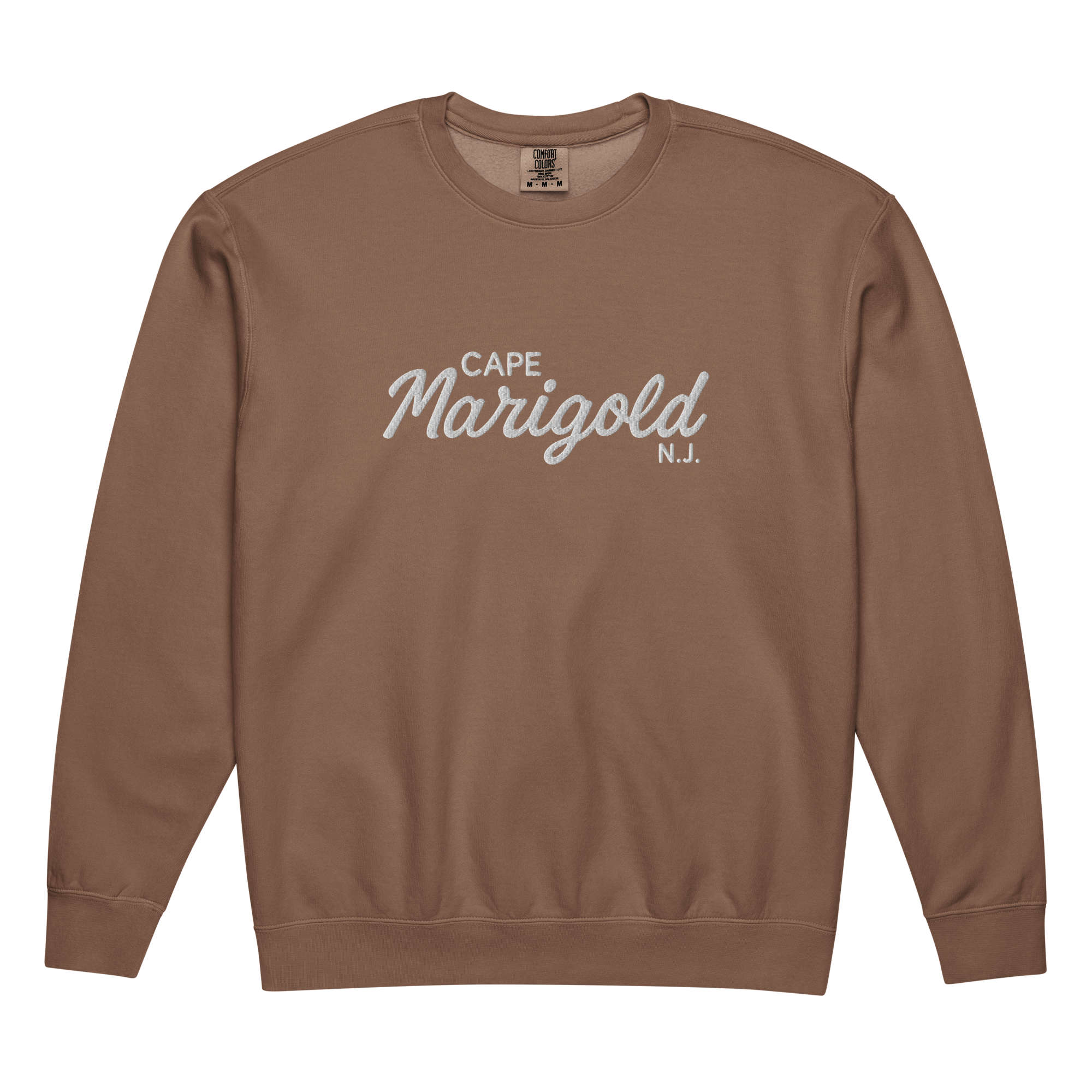
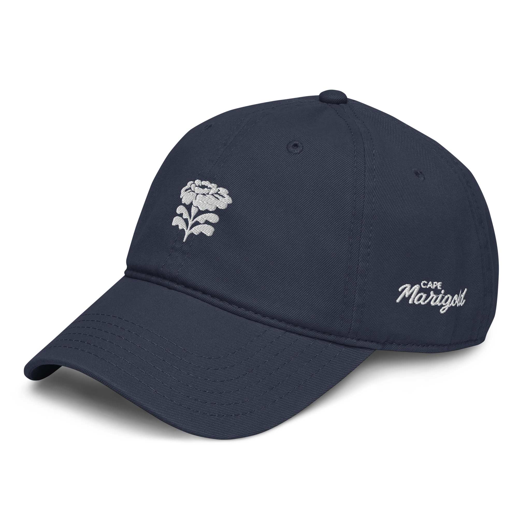
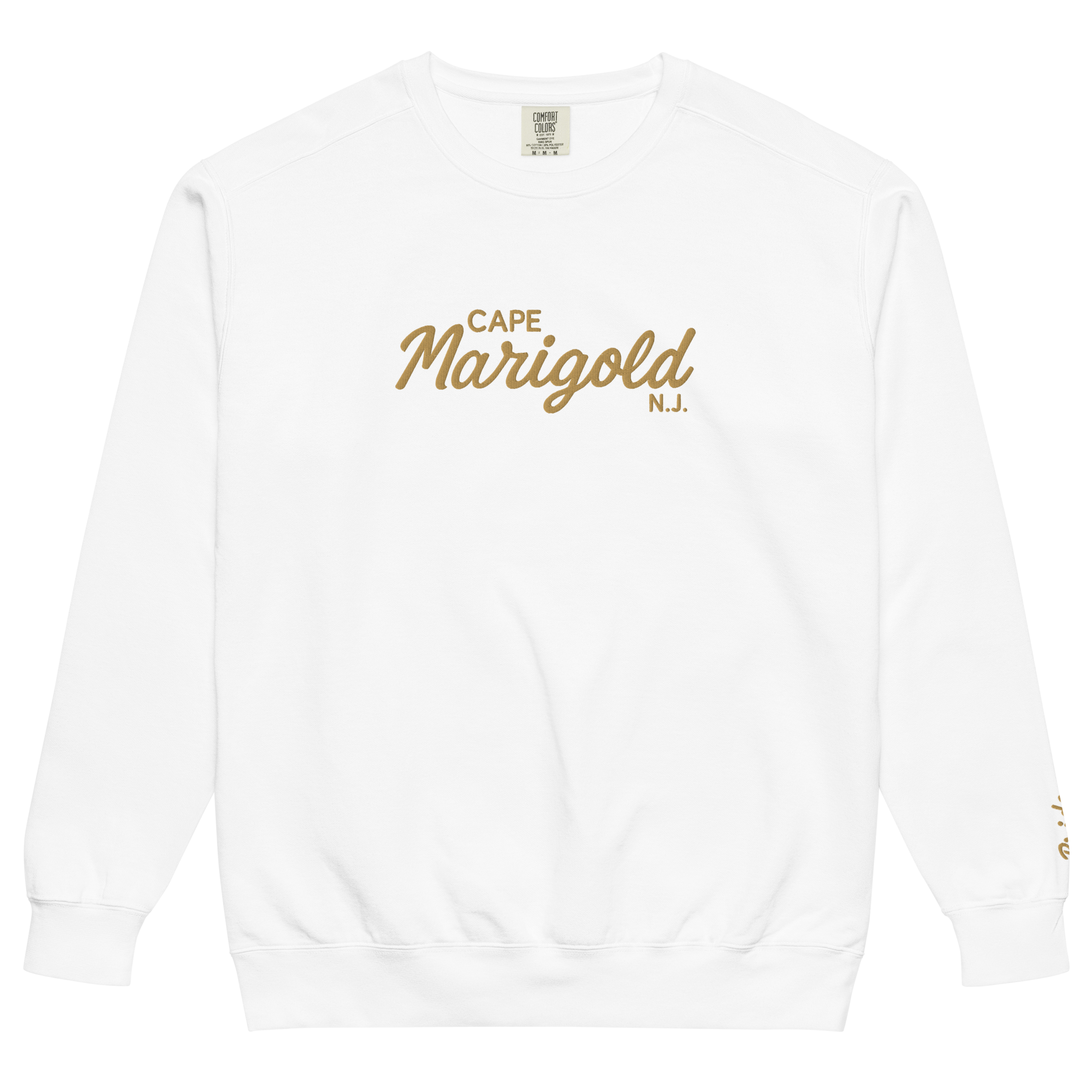
Each guest received a custom Cape Marigold sweatshirt and an embroidered baseball cap in a color selected to reflect their individual personality. The personalized color choices gave each guest something unique while maintaining a consistent design across the group.
Custom ribbon pins featuring the "Courtney Is Getting Married" design were also created for guests to wear throughout Cape May, serving as a subtle, recognizable detail that connected the group during the weekend.
The bride received her own coordinated collection, including a white sweatshirt, custom hat and a distinctive bridal ribbon pin. Together, the pieces offered a more thoughtful and wearable alternative to traditional matching bachelorette merchandise.
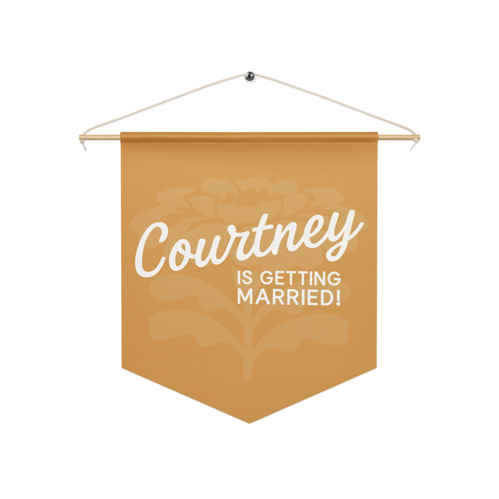
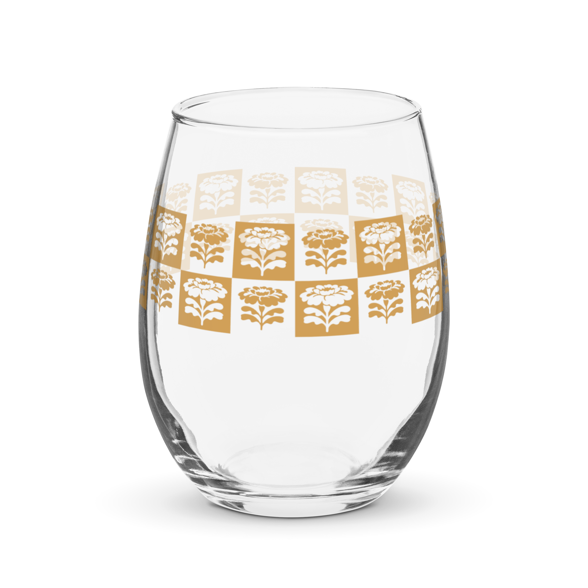
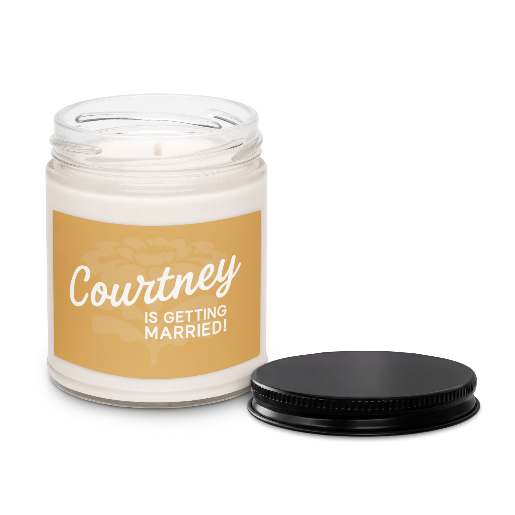
The Cape Marigold identity extended into the house itself through a collection of understated decorative elements and personalized keepsakes. A custom pennant welcomed guests at the entrance, while branded wine glasses and a coordinated table runner brought the visual identity into shared gathering spaces.
A custom plant, presented as a group gift, incorporated personalized decorative stakes that tied the gift into the weekend's overall design.
Rather than filling the space with traditional party decorations, the goal was to introduce intentional details that made the house feel like a branded destination while preserving its relaxed, coastal atmosphere.
A dedicated Cape Marigold website served as the central resource for the weekend, bringing together the itinerary, accommodations, activities and important guest information in one accessible location.
The website extended the visual identity into a functional digital experience, allowing guests to easily reference plans while reinforcing the weekend's cohesive branding. Supporting itinerary graphics carried the same typography and design approach into the event's communications.
By connecting the digital experience with the physical details, Cape Marigold became more than a collection of branded items. It created a consistent identity that guests could interact with throughout the entire getaway.
